A Design System You Can Walk Through
Built a modular retail design system for Hotbox that scaled to 11+ stores at 36-52% lower build cost, applied across 4 brands, and later licensed by the Cookies brand.
Design Systems
Retail
Compliant Environments
Customer Facing
Americann Made
About This Project
One modular system, built to scale across a regulated retail footprint.
Hotbox started as a product line under Americann Made and got popular enough to earn its own stores. Turning one flagship into a system that could open anywhere, fast, on budget, and still feel unmistakably Hotbox, was the job.
The Challenge
Hotbox started as a CPG cannabis brand under Americann Made and became well-known enough that the company opened its own retail stores for it. But Hotbox was one brand inside a much bigger problem: Americann Made operated 43 stores across its retail ecosystem, and every one of them needed custom fixtures because standard retail furniture doesn't work for a federally regulated product. Packaging, store setup, entry flow, even what a budtender is legally allowed to tell a customer, all of it sits under regulation that varies by location.
Building each store from scratch wasn't sustainable at that scale. And most dispensaries at the time felt the same way: secure, functional, and forgettable. The brief wasn't just to design a good-looking Hotbox flagship. It was to build something turnkey enough to rebrand for other stores and brands in the portfolio, while still giving customers, who ranged from recreational to a wide range of medical use cases, a real, accessible education on what they were buying.
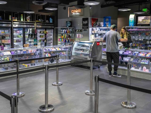
“Secure, functional, and forgettable.”
How I Approached It
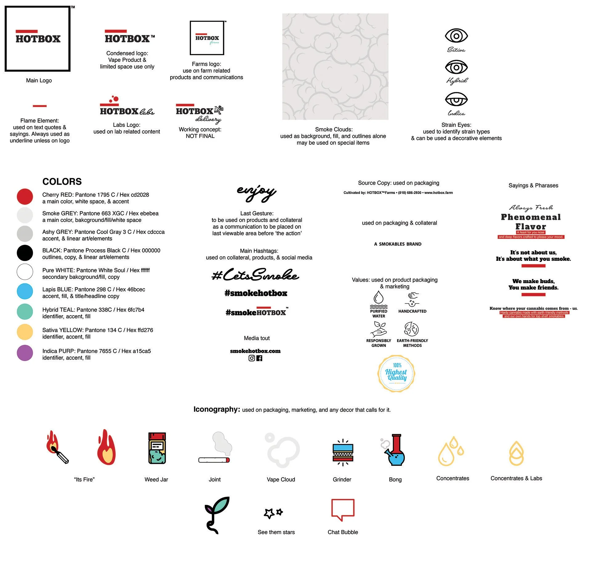
I led this from kickoff. I'd already founded the Hotbox brand before this, the name, the identity, the photography. This project was the discipline of taking a brand built for products, print, and digital, and turning it into a real-world space people could walk through.

I ran a competitive analysis and pulled from data we already had, loyalty program behavior and routine surveys from existing stores, so the direction was grounded in real customer patterns, not aesthetic preference.
“Grounded in real customer patterns, not aesthetic preference.”
The insight that shaped everything: a single store design wasn't the deliverable. A system was. I'd previously built staff training and learning programs for traditional retail, DVF flagship NYC (Diane Von Furstenberg) among them, and that experience is what pushed me toward designing the physical environment itself to do some of that teaching. Budtenders are usually not medical professionals, and they can't be the only source of accurate product information for customers making decisions across a wide range of needs.
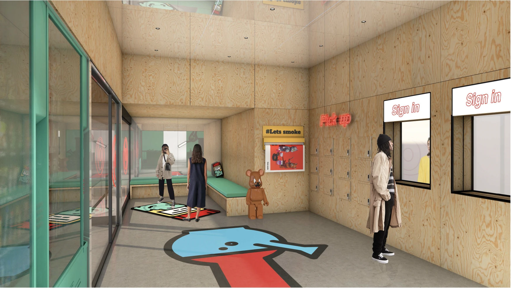
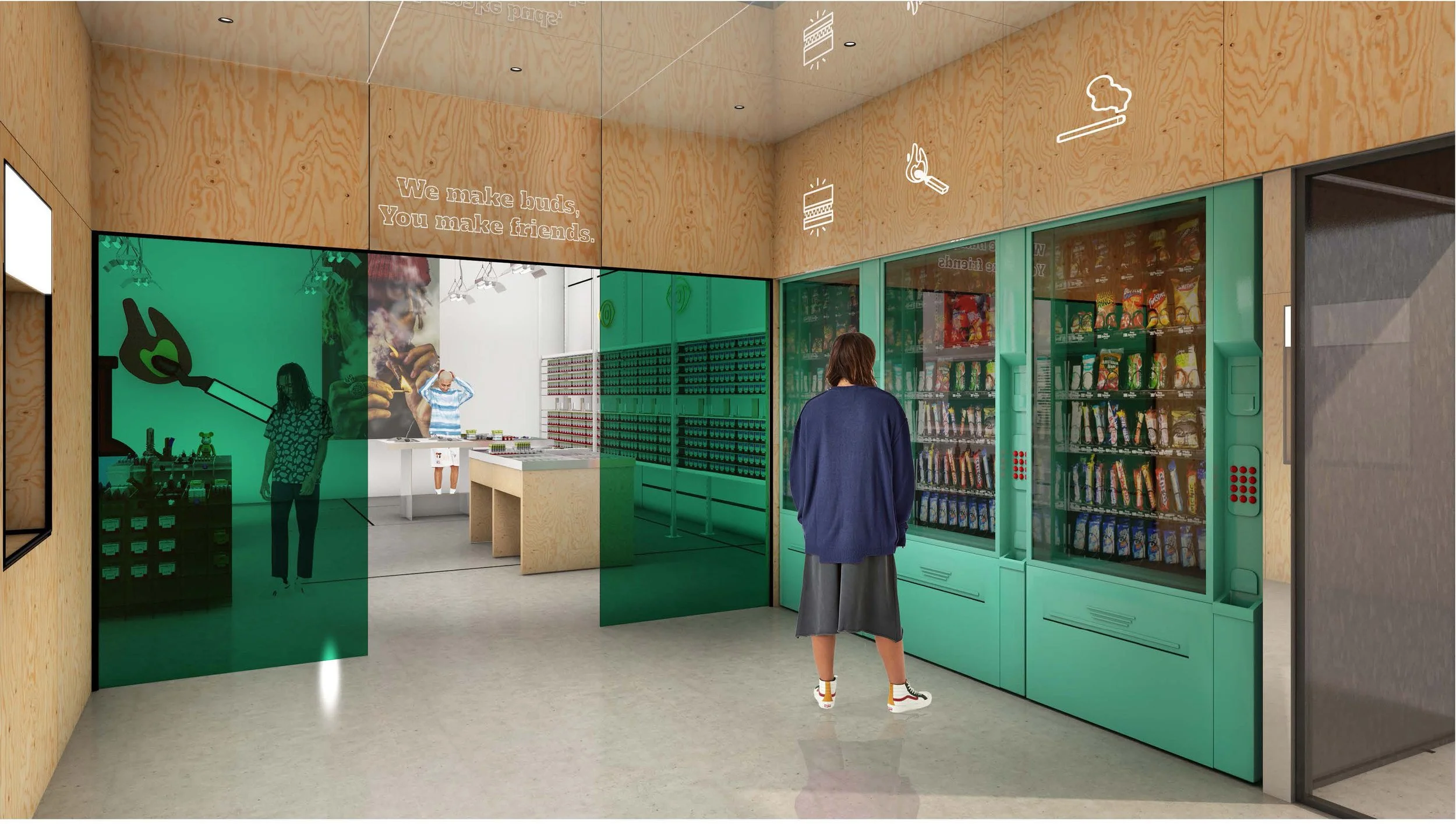
So I designed a toolbox: modular components, perimeter shelving, midfloor tables, signage, entrance kit, education layer, that could be selected differently at every site depending on size, budget, and local regulation, while staying visually and operationally consistent, and rebrandable for other brands in the portfolio, not locked to Hotbox alone. I worked with the Operator, COO, Head of Retail Ops, two business analysts, a visual designer, two industrial designers, an architecture agency, plus a local architect and joinery manufacturer to get it built.
What We Built
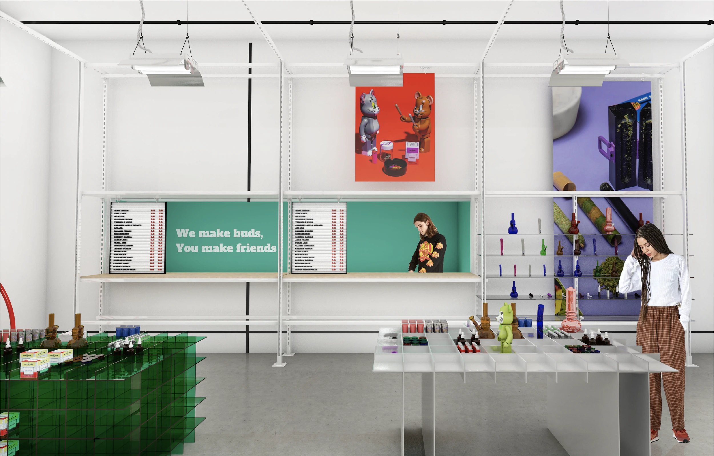
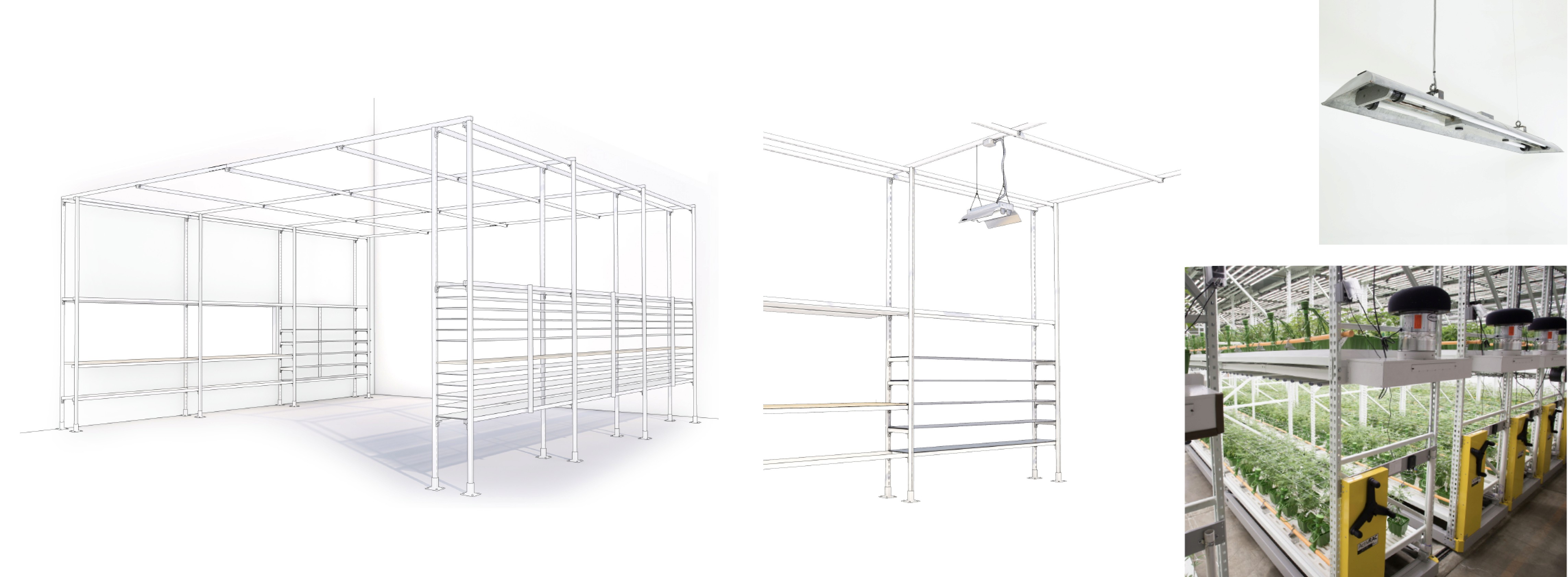
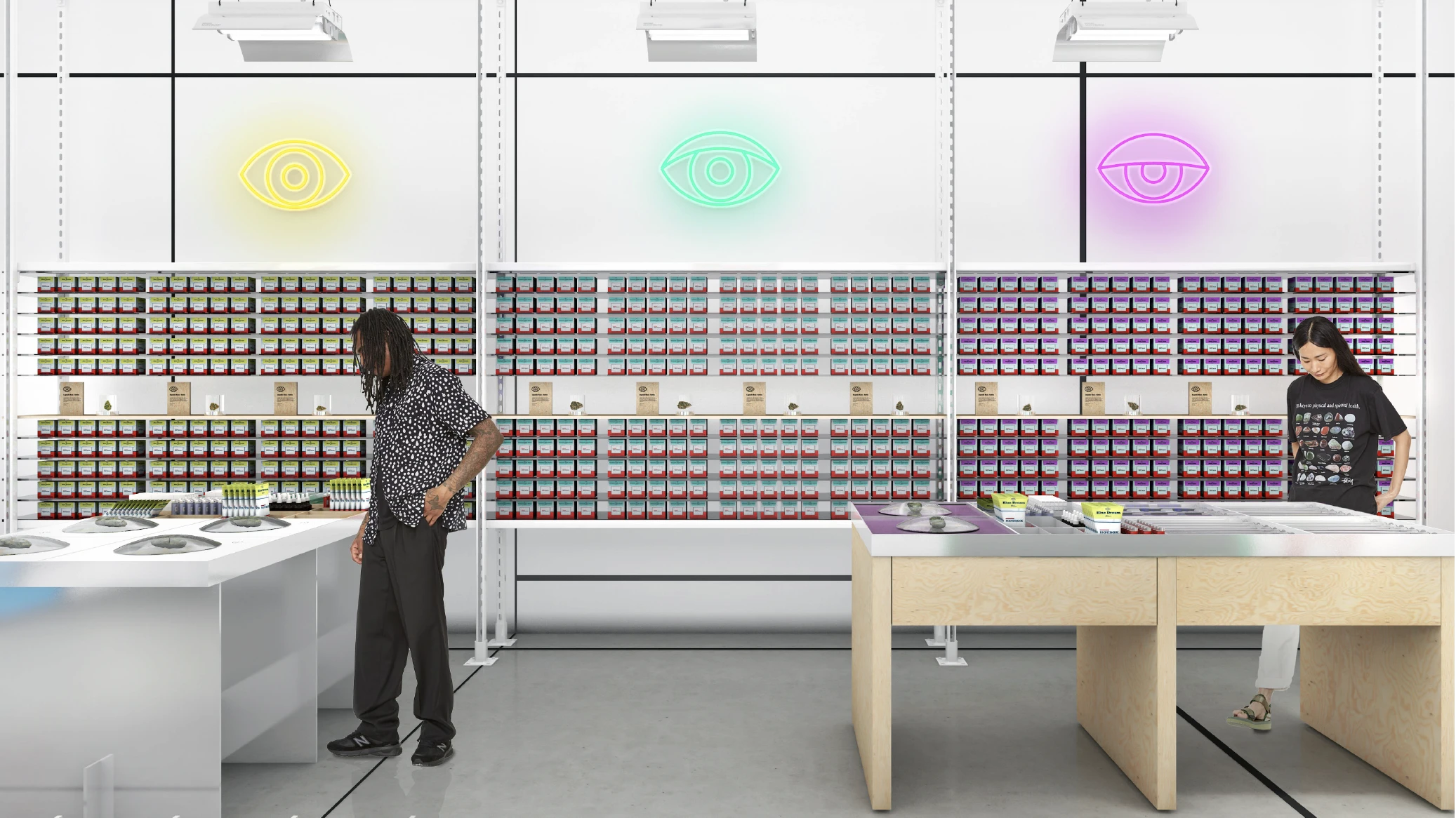
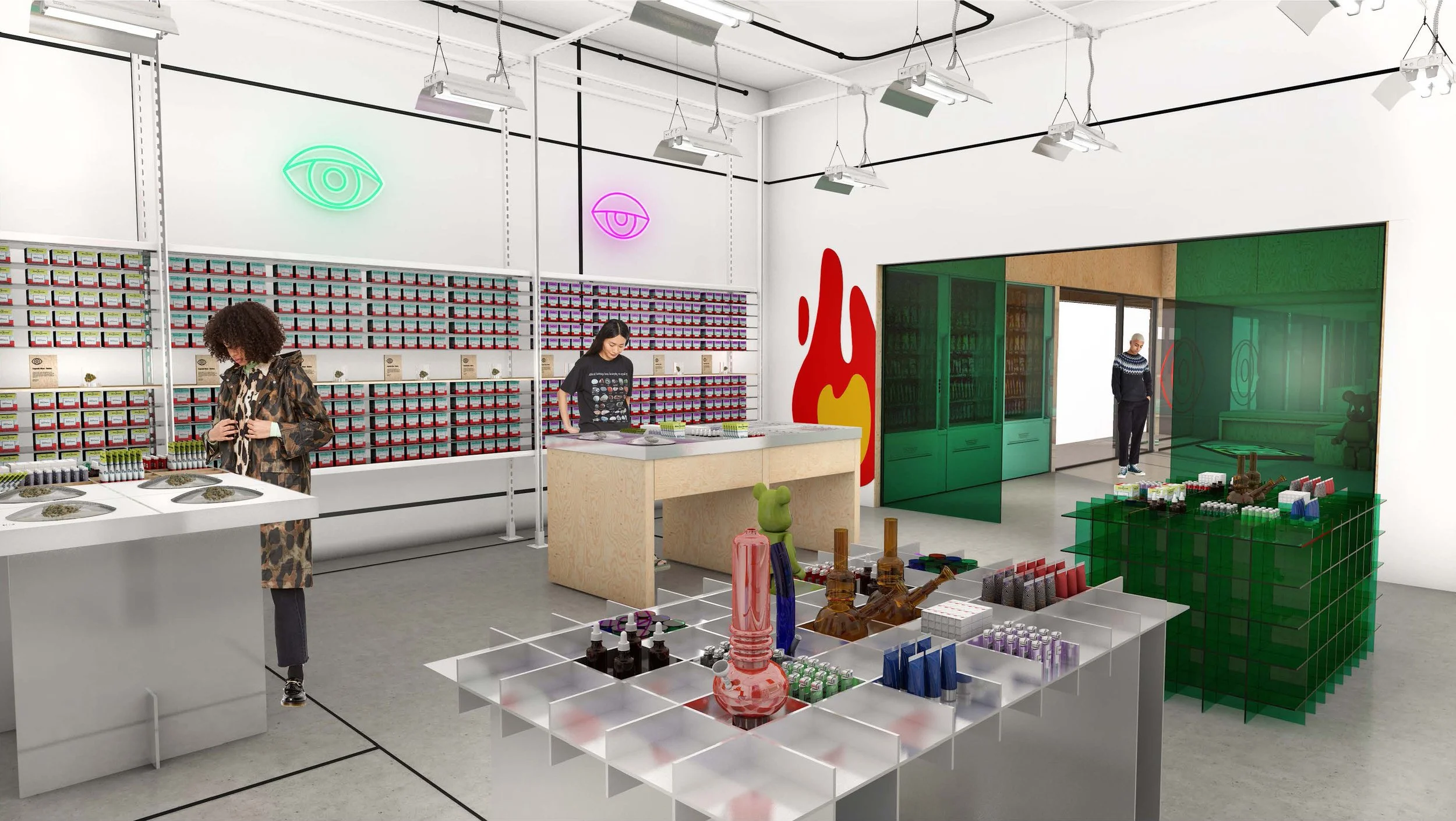
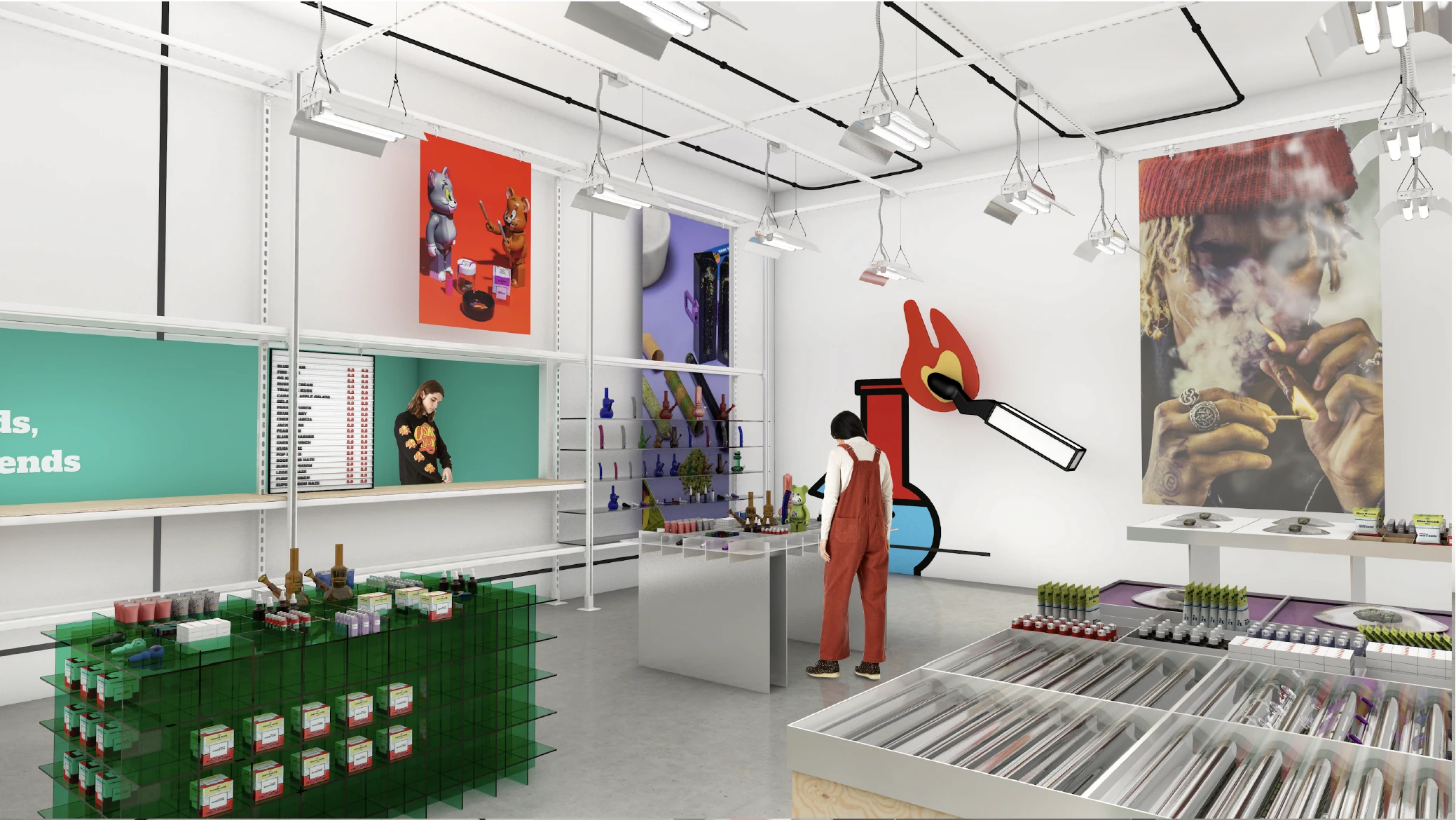
The perimeter system referenced grow racks, powder-coated punched steel that scales to any footprint.
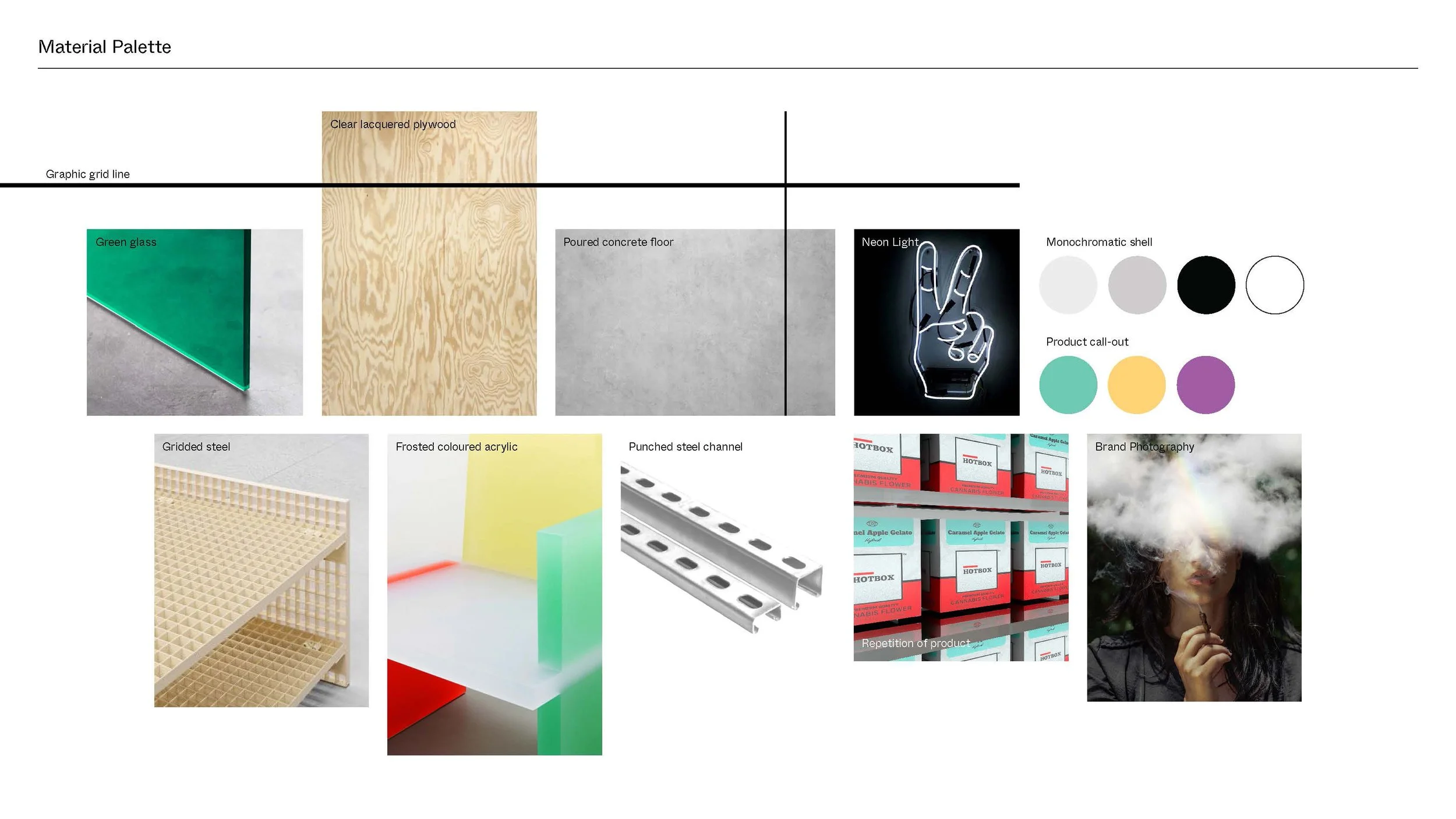
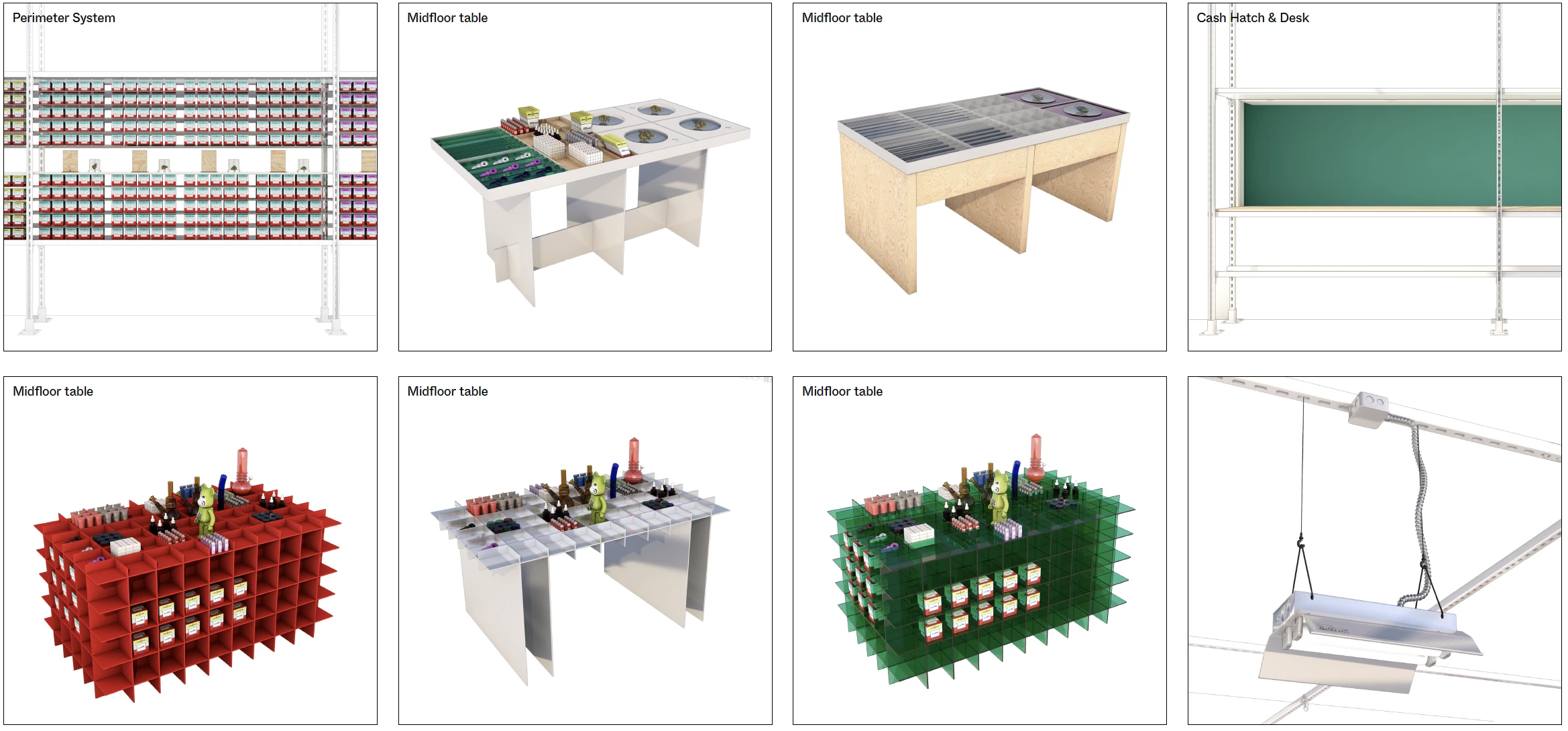
Midfloor tables shared one grid language across three finishes so plug-in accessories fit any location.
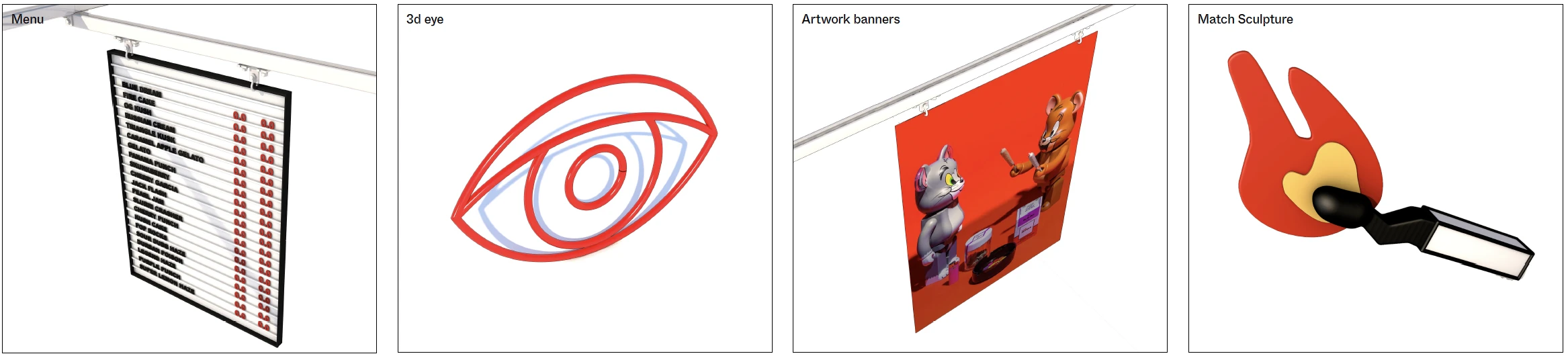
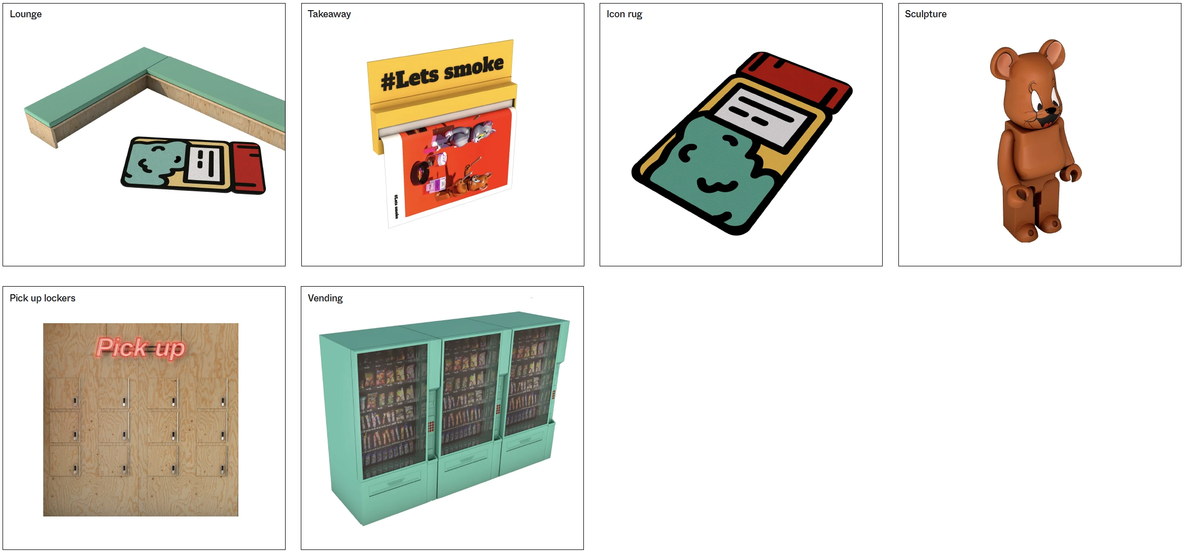
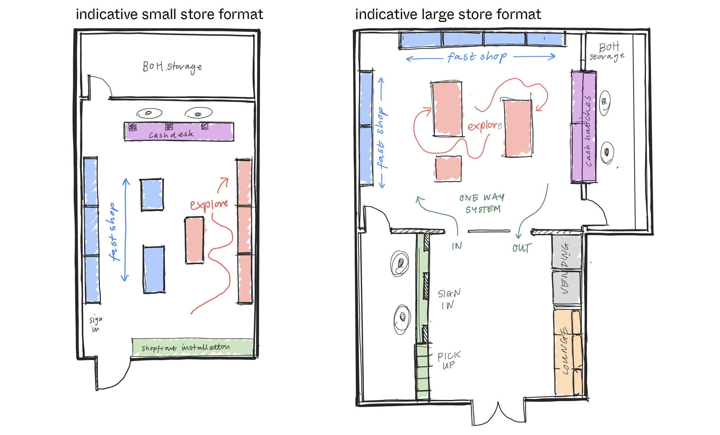
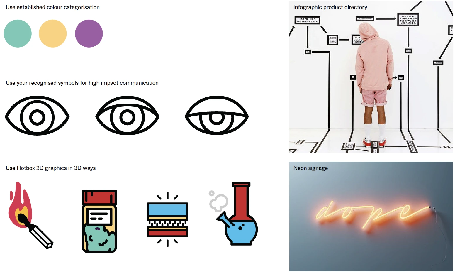
Product was organized by Indica, Sativa, and hybrid using consistent color coding, and wayfinding split into fast and exploratory lanes, a deliberate reference to how fast food chains move people efficiently without making the experience feel rushed.
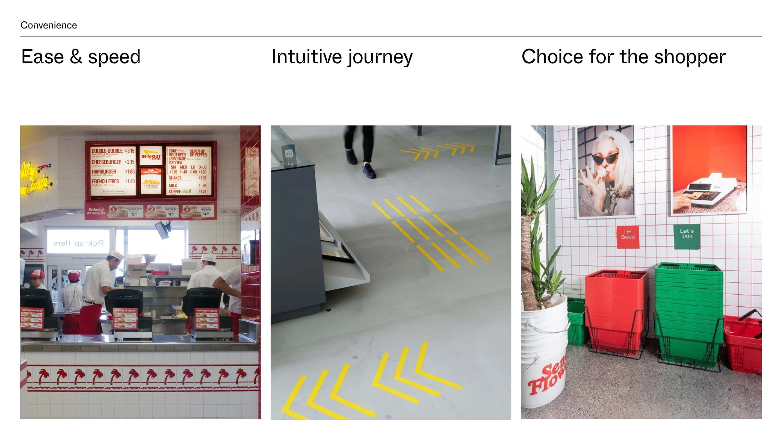
Pulling inspiration to how fast food chains and some stores move people efficiently without making the experience feel rushed.
The education layer mattered most. Magnified acrylic cases let customers see and smell product before buying.
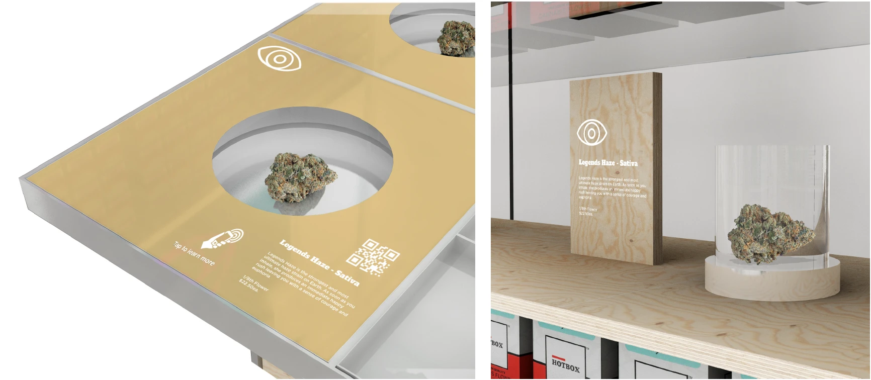
NFC and QR tags let people pull full product information straight to their phone, backed by a database built specifically to lighten the informational load on staff. The goal wasn't just compliance. It was giving customers real, science-grounded information, botany, effects, flavor, in a format that felt like a lifestyle brand, not a locked pharmacy counter.
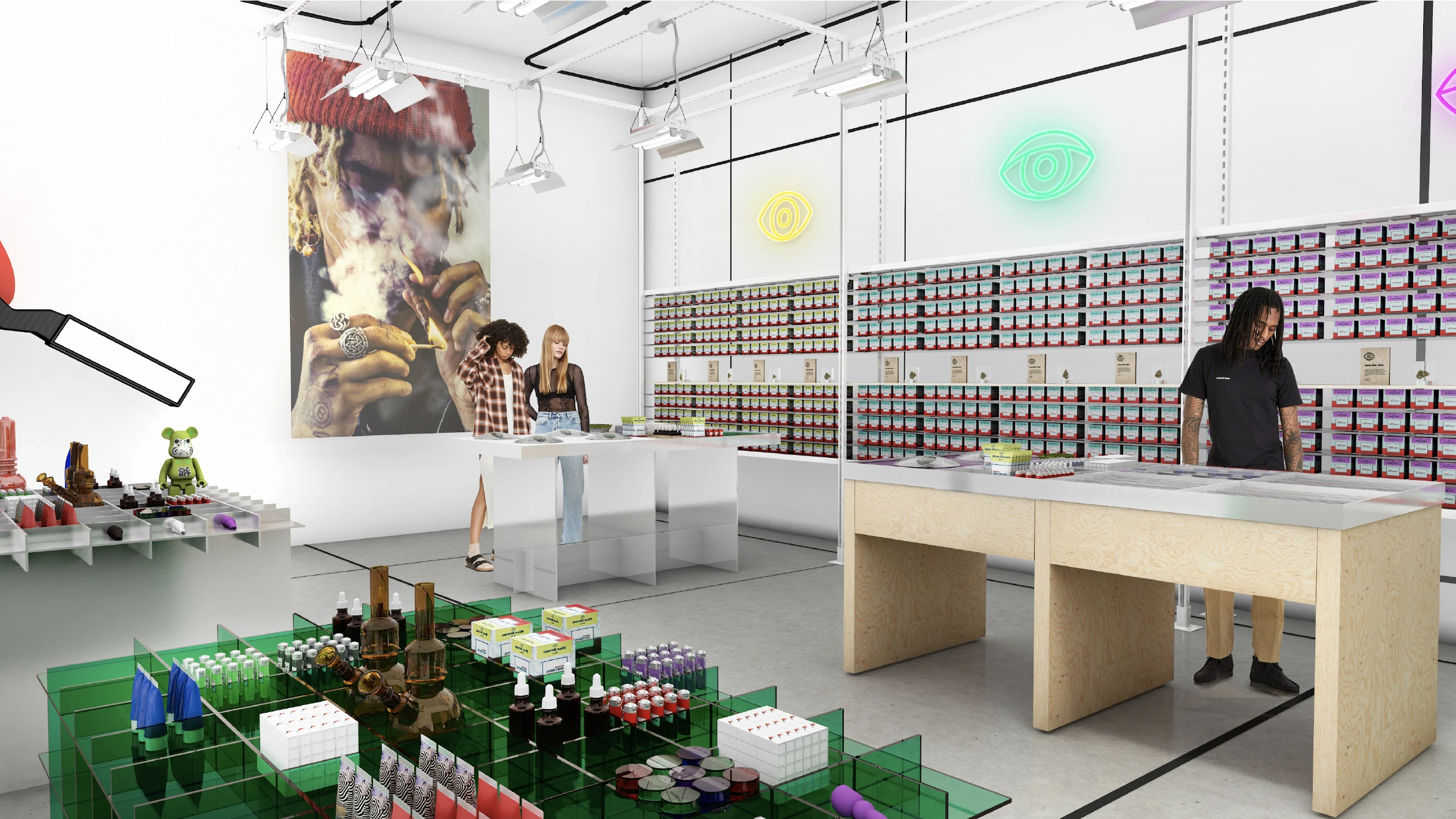
Giving customers real, science-grounded information… in a format that felt like a lifestyle brand, not a locked pharmacy counter.
Outcome
12+ Hotbox locations built on this system, up from the original 6-store rollout
19–33% cost savings on average build cost per location versus custom-designing each site
4.6 average rating across Yelp, Weedmaps, Leafly, and CannaSOS
Social media engagement rose significantly after the first 3 stores opened
Licensed beyond Hotbox: adopted as the retail model for Cookies & Lemonade stores in California and Florida, through a strategic retail partnership with the Cookies brand
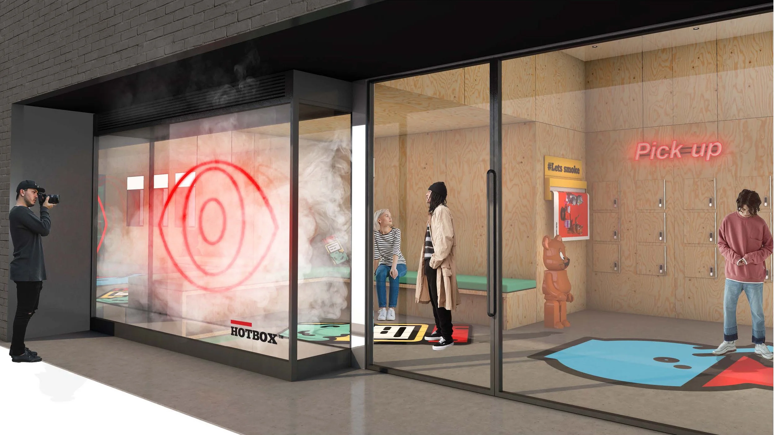
The system did what it was built to do. It scaled past the brand it started with.
Reflection
The parts I put the most thought into just worked, no big reaction, they just did the job. What was fun to watch was that out of everything we designed, from the education layer to the wayfinding, the simplest thing, the grow-house walls, became what customers connected with most and what turned into the most photographed spot in every store. Designing for a physical space instead of a screen forced me to think about human factors on a whole different level, not just what someone sees, but how they move, what they touch, and how free they feel to just browse. Good design is good business. This project proved that plainly.
The simplest thing… became what customers connected with most and what turned into the most shared image on social media from the stores.
A Design System You Can Walk Through
Built a modular retail design system for Hotbox that scaled to 11+ stores at 36-52% lower build cost, applied across 4 brands, and later licensed by the Cookies brand.
Design Systems
Retail
Compliant Environments
Customer Facing
Americann Made
About This Project
One modular system, built to scale across a regulated retail footprint.
Hotbox started as a product line under Americann Made and got popular enough to earn its own stores. Turning one flagship into a system that could open anywhere, fast, on budget, and still feel unmistakably Hotbox, was the job.
The Challenge
Hotbox started as a CPG cannabis brand under Americann Made and became well-known enough that the company opened its own retail stores for it. But Hotbox was one brand inside a much bigger problem: Americann Made operated 43 stores across its retail ecosystem, and every one of them needed custom fixtures because standard retail furniture doesn't work for a federally regulated product. Packaging, store setup, entry flow, even what a budtender is legally allowed to tell a customer, all of it sits under regulation that varies by location.
Building each store from scratch wasn't sustainable at that scale. And most dispensaries at the time felt the same way: secure, functional, and forgettable. The brief wasn't just to design a good-looking Hotbox flagship. It was to build something turnkey enough to rebrand for other stores and brands in the portfolio, while still giving customers, who ranged from recreational to a wide range of medical use cases, a real, accessible education on what they were buying.
“Secure, functional, and forgettable.”
How I Approached It
I led this from kickoff. I'd already founded the Hotbox brand before this, the name, the identity, the photography. This project was the discipline of taking a brand built for products, print, and digital, and turning it into a real-world space people could walk through.
I ran a competitive analysis and pulled from data we already had, loyalty program behavior and routine surveys from existing stores, so the direction was grounded in real customer patterns, not aesthetic preference.
“Grounded in real customer patterns, not aesthetic preference.”
The insight that shaped everything: a single store design wasn't the deliverable. A system was. I'd previously built staff training and learning programs for traditional retail, DVF flagship NYC (Diane Von Furstenberg) among them, and that experience is what pushed me toward designing the physical environment itself to do some of that teaching. Budtenders are usually not medical professionals, and they can't be the only source of accurate product information for customers making decisions across a wide range of needs.
So I designed a toolbox: modular components, perimeter shelving, midfloor tables, signage, entrance kit, education layer, that could be selected differently at every site depending on size, budget, and local regulation, while staying visually and operationally consistent, and rebrandable for other brands in the portfolio, not locked to Hotbox alone. I worked with the Operator, COO, Head of Retail Ops, two business analysts, a visual designer, two industrial designers, an architecture agency, plus a local architect and joinery manufacturer to get it built.
What We Built
The perimeter system referenced grow racks, powder-coated punched steel that scales to any footprint.
Midfloor tables shared one grid language across three finishes so plug-in accessories fit any location.
Product was organized by Indica, Sativa, and hybrid using consistent color coding, and wayfinding split into fast and exploratory lanes, a deliberate reference to how fast food chains move people efficiently without making the experience feel rushed.
Pulling inspiration to how fast food chains and some stores move people efficiently without making the experience feel rushed.
The education layer mattered most. Magnified acrylic cases let customers see and smell product before buying.
NFC and QR tags let people pull full product information straight to their phone, backed by a database built specifically to lighten the informational load on staff. The goal wasn't just compliance. It was giving customers real, science-grounded information, botany, effects, flavor, in a format that felt like a lifestyle brand, not a locked pharmacy counter.
Giving customers real, science-grounded information… in a format that felt like a lifestyle brand, not a locked pharmacy counter.
Outcome
12+ Hotbox locations built on this system, up from the original 6-store rollout
19–33% cost savings on average build cost per location versus custom-designing each site
4.6 average rating across Yelp, Weedmaps, Leafly, and CannaSOS
Social media engagement rose significantly after the first 3 stores opened
Licensed beyond Hotbox: adopted as the retail model for Cookies & Lemonade stores in California and Florida, through a strategic retail partnership with the Cookies brand
The system did what it was built to do. It scaled past the brand it started with.
Reflection
The parts I put the most thought into just worked, no big reaction, they just did the job. What was fun to watch was that out of everything we designed, from the education layer to the wayfinding, the simplest thing, the grow-house walls, became what customers connected with most and what turned into the most photographed spot in every store. Designing for a physical space instead of a screen forced me to think about human factors on a whole different level, not just what someone sees, but how they move, what they touch, and how free they feel to just browse. Good design is good business. This project proved that plainly.
The simplest thing… became what customers connected with most and what turned into the most shared image on social media from the stores.
A Design System You Can Walk Through
Built a modular retail design system for Hotbox that scaled to 11+ stores at 36-52% lower build cost, applied across 4 brands, and later licensed by the Cookies brand.
Design Systems
Retail
Compliant Environments
Customer Facing
Americann Made
About This Project
One modular system, built to scale across a regulated retail footprint.
Hotbox started as a product line under Americann Made and got popular enough to earn its own stores. Turning one flagship into a system that could open anywhere, fast, on budget, and still feel unmistakably Hotbox, was the job.
The Challenge
Hotbox started as a CPG cannabis brand under Americann Made and became well-known enough that the company opened its own retail stores for it. But Hotbox was one brand inside a much bigger problem: Americann Made operated 43 stores across its retail ecosystem, and every one of them needed custom fixtures because standard retail furniture doesn't work for a federally regulated product. Packaging, store setup, entry flow, even what a budtender is legally allowed to tell a customer, all of it sits under regulation that varies by location.
Building each store from scratch wasn't sustainable at that scale. And most dispensaries at the time felt the same way: secure, functional, and forgettable. The brief wasn't just to design a good-looking Hotbox flagship. It was to build something turnkey enough to rebrand for other stores and brands in the portfolio, while still giving customers, who ranged from recreational to a wide range of medical use cases, a real, accessible education on what they were buying.
“Secure, functional, and forgettable.”
How I Approached It
I led this from kickoff. I'd already founded the Hotbox brand before this, the name, the identity, the photography. This project was the discipline of taking a brand built for products, print, and digital, and turning it into a real-world space people could walk through.
I ran a competitive analysis and pulled from data we already had, loyalty program behavior and routine surveys from existing stores, so the direction was grounded in real customer patterns, not aesthetic preference.
“Grounded in real customer patterns, not aesthetic preference.”
The insight that shaped everything: a single store design wasn't the deliverable. A system was. I'd previously built staff training and learning programs for traditional retail, DVF flagship NYC (Diane Von Furstenberg) among them, and that experience is what pushed me toward designing the physical environment itself to do some of that teaching. Budtenders are usually not medical professionals, and they can't be the only source of accurate product information for customers making decisions across a wide range of needs.
So I designed a toolbox: modular components, perimeter shelving, midfloor tables, signage, entrance kit, education layer, that could be selected differently at every site depending on size, budget, and local regulation, while staying visually and operationally consistent, and rebrandable for other brands in the portfolio, not locked to Hotbox alone. I worked with the Operator, COO, Head of Retail Ops, two business analysts, a visual designer, two industrial designers, an architecture agency, plus a local architect and joinery manufacturer to get it built.
What We Built
The perimeter system referenced grow racks, powder-coated punched steel that scales to any footprint.
Midfloor tables shared one grid language across three finishes so plug-in accessories fit any location.
Product was organized by Indica, Sativa, and hybrid using consistent color coding, and wayfinding split into fast and exploratory lanes, a deliberate reference to how fast food chains move people efficiently without making the experience feel rushed.
Pulling inspiration to how fast food chains and some stores move people efficiently without making the experience feel rushed.
The education layer mattered most. Magnified acrylic cases let customers see and smell product before buying.
NFC and QR tags let people pull full product information straight to their phone, backed by a database built specifically to lighten the informational load on staff. The goal wasn't just compliance. It was giving customers real, science-grounded information, botany, effects, flavor, in a format that felt like a lifestyle brand, not a locked pharmacy counter.
Giving customers real, science-grounded information… in a format that felt like a lifestyle brand, not a locked pharmacy counter.
Outcome
12+ Hotbox locations built on this system, up from the original 6-store rollout
19–33% cost savings on average build cost per location versus custom-designing each site
4.6 average rating across Yelp, Weedmaps, Leafly, and CannaSOS
Social media engagement rose significantly after the first 3 stores opened
Licensed beyond Hotbox: adopted as the retail model for Cookies & Lemonade stores in California and Florida, through a strategic retail partnership with the Cookies brand
The system did what it was built to do. It scaled past the brand it started with.
Reflection
The parts I put the most thought into just worked, no big reaction, they just did the job. What was fun to watch was that out of everything we designed, from the education layer to the wayfinding, the simplest thing, the grow-house walls, became what customers connected with most and what turned into the most photographed spot in every store. Designing for a physical space instead of a screen forced me to think about human factors on a whole different level, not just what someone sees, but how they move, what they touch, and how free they feel to just browse. Good design is good business. This project proved that plainly.
The simplest thing… became what customers connected with most and what turned into the most shared image on social media from the stores.
A Design System You Can Walk Through
Built a modular retail design system for Hotbox that scaled to 11+ stores at 36-52% lower build cost, applied across 4 brands, and later licensed by the Cookies brand.
Design Systems
Retail
Compliant Environments
Customer Facing
Americann Made
About This Project
One modular system, built to scale across a regulated retail footprint.
Hotbox started as a product line under Americann Made and got popular enough to earn its own stores. Turning one flagship into a system that could open anywhere, fast, on budget, and still feel unmistakably Hotbox, was the job.
The Challenge
Hotbox started as a CPG cannabis brand under Americann Made and became well-known enough that the company opened its own retail stores for it. But Hotbox was one brand inside a much bigger problem: Americann Made operated 43 stores across its retail ecosystem, and every one of them needed custom fixtures because standard retail furniture doesn't work for a federally regulated product. Packaging, store setup, entry flow, even what a budtender is legally allowed to tell a customer, all of it sits under regulation that varies by location.
Building each store from scratch wasn't sustainable at that scale. And most dispensaries at the time felt the same way: secure, functional, and forgettable. The brief wasn't just to design a good-looking Hotbox flagship. It was to build something turnkey enough to rebrand for other stores and brands in the portfolio, while still giving customers, who ranged from recreational to a wide range of medical use cases, a real, accessible education on what they were buying.
“Secure, functional, and forgettable.”
How I Approached It
I led this from kickoff. I'd already founded the Hotbox brand before this, the name, the identity, the photography. This project was the discipline of taking a brand built for products, print, and digital, and turning it into a real-world space people could walk through.
I ran a competitive analysis and pulled from data we already had, loyalty program behavior and routine surveys from existing stores, so the direction was grounded in real customer patterns, not aesthetic preference.
“Grounded in real customer patterns, not aesthetic preference.”
The insight that shaped everything: a single store design wasn't the deliverable. A system was. I'd previously built staff training and learning programs for traditional retail, DVF flagship NYC (Diane Von Furstenberg) among them, and that experience is what pushed me toward designing the physical environment itself to do some of that teaching. Budtenders are usually not medical professionals, and they can't be the only source of accurate product information for customers making decisions across a wide range of needs.
So I designed a toolbox: modular components, perimeter shelving, midfloor tables, signage, entrance kit, education layer, that could be selected differently at every site depending on size, budget, and local regulation, while staying visually and operationally consistent, and rebrandable for other brands in the portfolio, not locked to Hotbox alone. I worked with the Operator, COO, Head of Retail Ops, two business analysts, a visual designer, two industrial designers, an architecture agency, plus a local architect and joinery manufacturer to get it built.
What We Built
The perimeter system referenced grow racks, powder-coated punched steel that scales to any footprint.
Midfloor tables shared one grid language across three finishes so plug-in accessories fit any location.
Product was organized by Indica, Sativa, and hybrid using consistent color coding, and wayfinding split into fast and exploratory lanes, a deliberate reference to how fast food chains move people efficiently without making the experience feel rushed.
Pulling inspiration to how fast food chains and some stores move people efficiently without making the experience feel rushed.
The education layer mattered most. Magnified acrylic cases let customers see and smell product before buying.
NFC and QR tags let people pull full product information straight to their phone, backed by a database built specifically to lighten the informational load on staff. The goal wasn't just compliance. It was giving customers real, science-grounded information, botany, effects, flavor, in a format that felt like a lifestyle brand, not a locked pharmacy counter.
Giving customers real, science-grounded information… in a format that felt like a lifestyle brand, not a locked pharmacy counter.
Outcome
12+ Hotbox locations built on this system, up from the original 6-store rollout
19–33% cost savings on average build cost per location versus custom-designing each site
4.6 average rating across Yelp, Weedmaps, Leafly, and CannaSOS
Social media engagement rose significantly after the first 3 stores opened
Licensed beyond Hotbox: adopted as the retail model for Cookies & Lemonade stores in California and Florida, through a strategic retail partnership with the Cookies brand
The system did what it was built to do. It scaled past the brand it started with.
Reflection
The parts I put the most thought into just worked, no big reaction, they just did the job. What was fun to watch was that out of everything we designed, from the education layer to the wayfinding, the simplest thing, the grow-house walls, became what customers connected with most and what turned into the most photographed spot in every store. Designing for a physical space instead of a screen forced me to think about human factors on a whole different level, not just what someone sees, but how they move, what they touch, and how free they feel to just browse. Good design is good business. This project proved that plainly.
The simplest thing… became what customers connected with most and what turned into the most shared image on social media from the stores.