
U.S. Bank
About This Project
U.S. Bank's design system served 1,500+ white-labeled partner brands, a large source of revenue for the bank. The token architecture behind it wasn't built to carry that weight, and every brand that couldn't fit inside it meant hand-coded work outside the system.
The Challenge
U.S. Bank's design system served 1,500+ white-labeled partner brands, brands that account for a large share of the bank's revenue. The system couldn't keep up with them. Partners couldn't fully express their own color palettes on their white-labeled products. Every deviation from the system meant custom code, work that fell outside the tokens and landed directly on design and engineering.
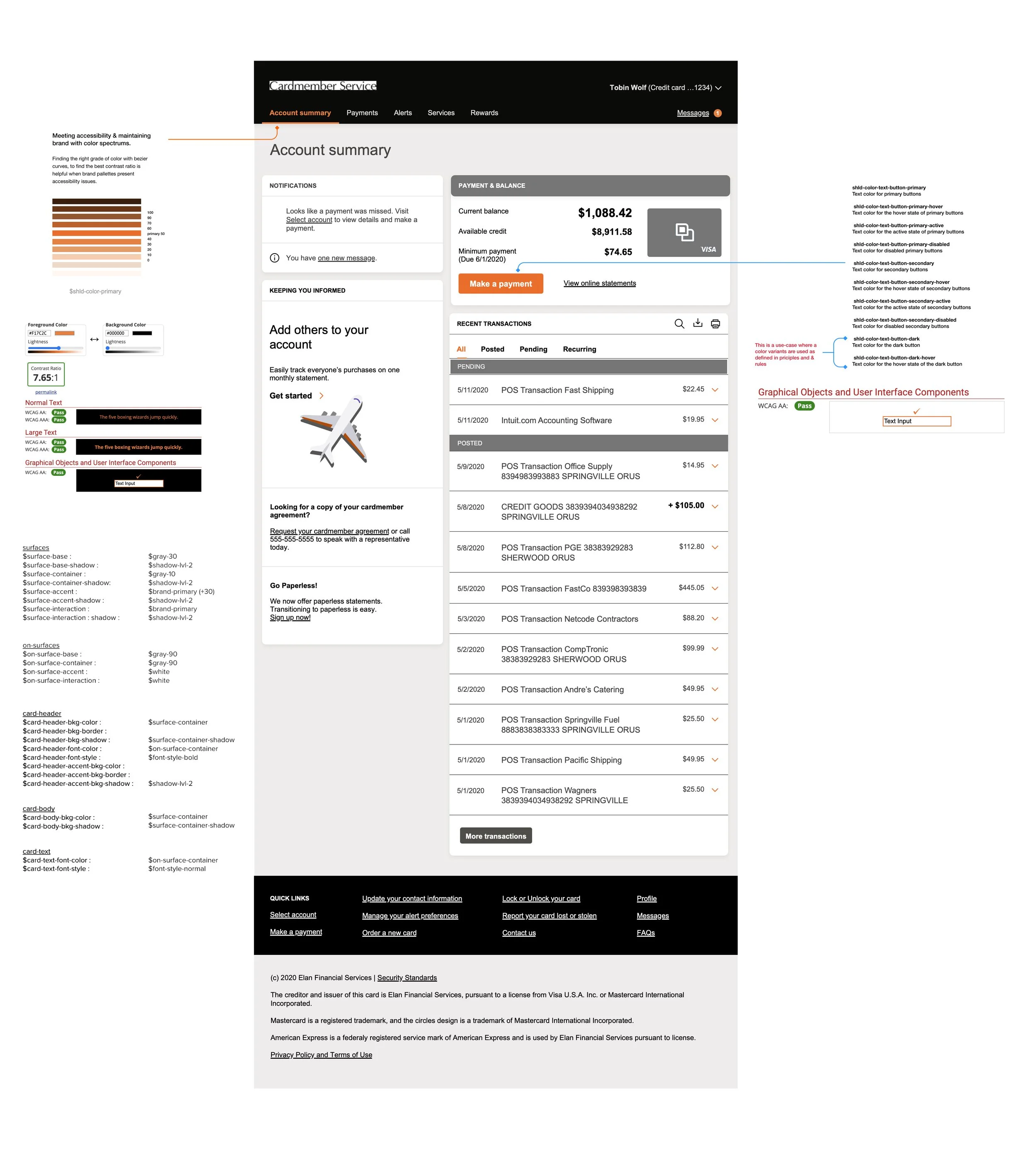
Sample of token mapping to Harley Davidson white-label products
The workaround was worse than the problem it was solving. Teams documented color selections per product page in a PDF form, then went back and forth by hand over accessibility issues and brand alignment, then had engineers hand-code each page outside the design system, because the tokens weren't built for palettes larger than U.S. Bank's own. Across 1,500+ partners, that meant real bottlenecks: slower time to solution for designers, brand liaisons, and developers alike.
How I Approached It
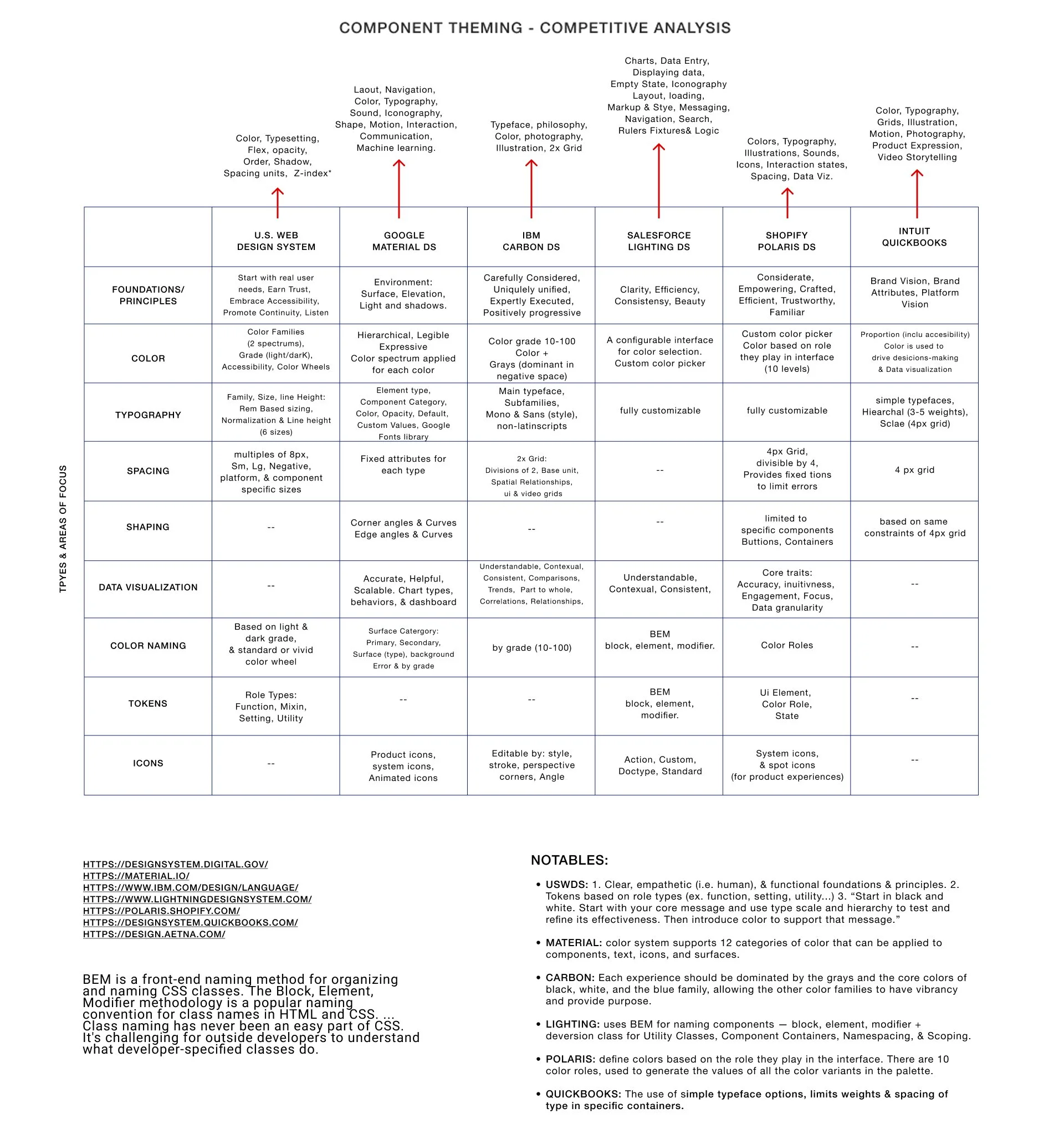
I started with a lot of ambiguity. We knew something was broken, but not exactly what, only that it kept straining relationships with partner teams. I ran a discovery session with a partner support team to see the white-labeling workflow firsthand, then widened out: a competitive analysis across six major design systems, USWDS, Google Material, IBM Carbon, Salesforce Lightning, Shopify Polaris, Intuit QuickBooks, to see how each handled component theming, color, typography, and token structure.
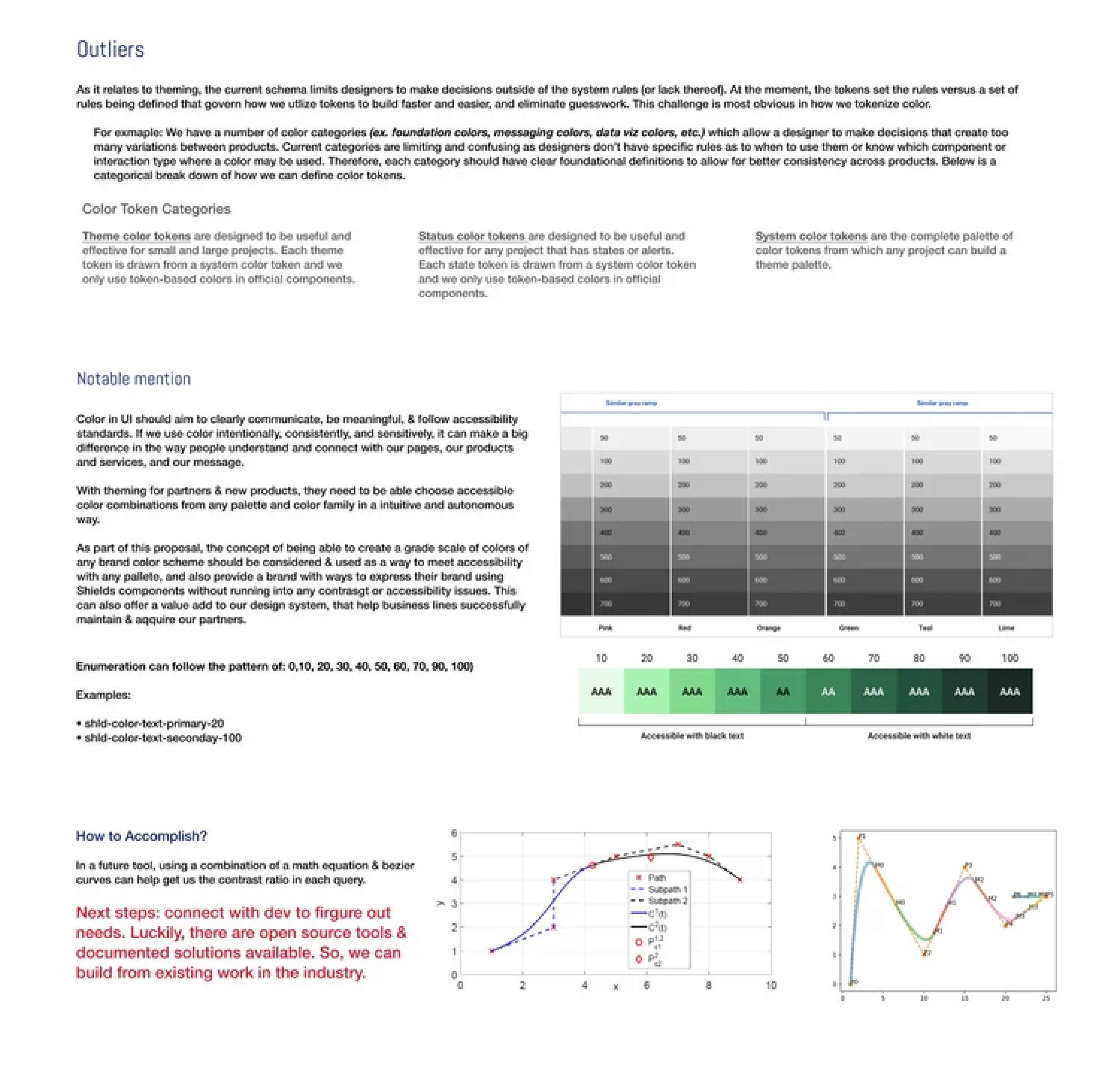
Then I interviewed 8 teams, designers, product managers, accessibility consultants, and partner brand liaisons, across several sessions. That confirmed what the competitive research suggested: our tokens were the limiting factor. I had to build the case for that in terms the business would act on, what the limits were actually costing in production time, resourcing, and partner-brand retention. The fix wasn't a small edit. It meant restructuring the token schema across the entire component and pattern library. I worked closely with the DS Core team, designers, developers, and product owners across nine internal teams, plus several partner brand teams who tested the schema against their own palettes.
What We Built
I built the new schema around a concept I called Purpose, tokens named for the role they play in the interface, not just their value. A button's primary color and a data table's border shouldn't share a naming convention just because they're both blue. I mapped every component to what needed to be themable, and at what depth: color, borders, elevation, shadows, shape, size, fonts.
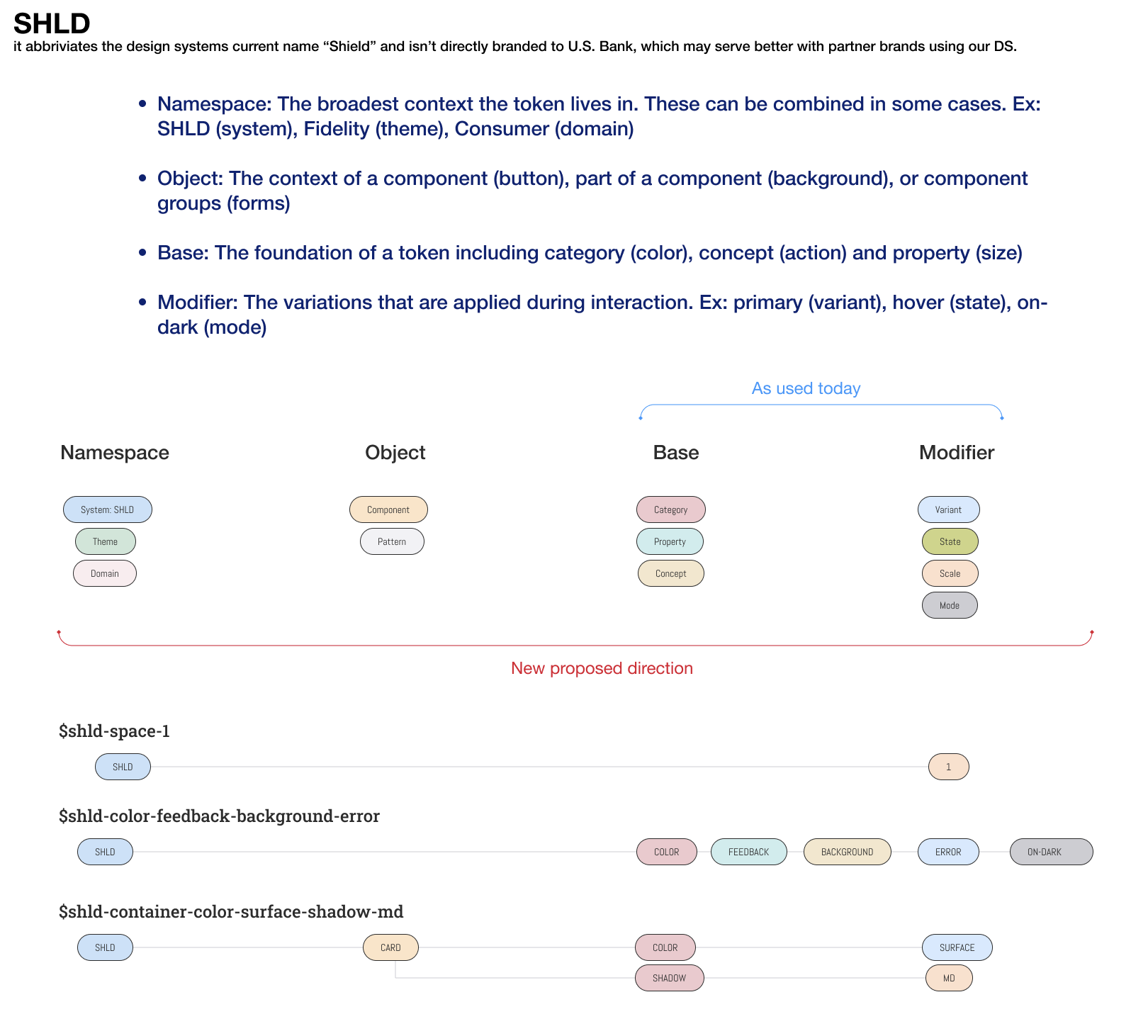
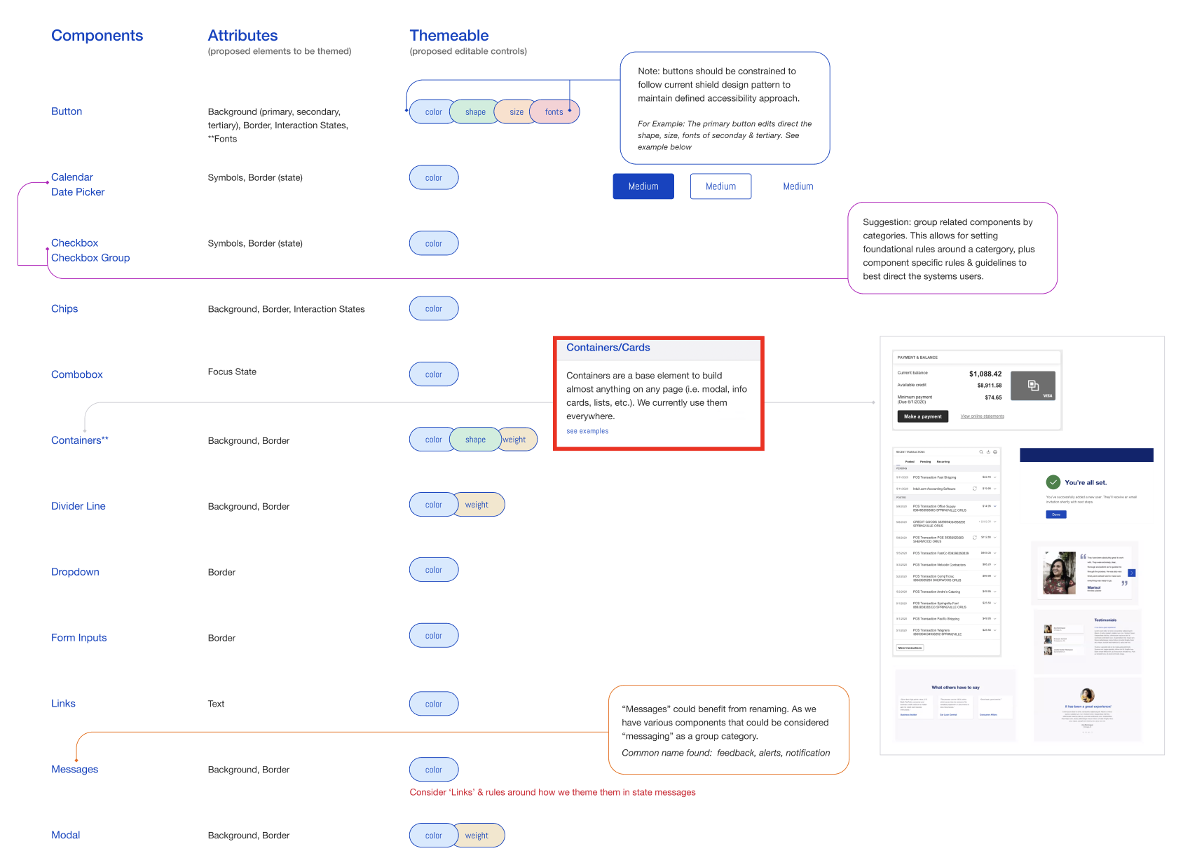
The naming system, I called it SHLD, deliberately not U.S. Bank-branded, since it needed to serve partner brands who don't want their parent bank's name inside their own tooling, ran four levels deep: Namespace (the system itself), Object (the component), Base (the foundational category, like color or size), and Modifier (the variation applied on interaction, like hover or dark mode). It mapped onto our existing Atomic Design structure: Elements, Compounds, Pages.
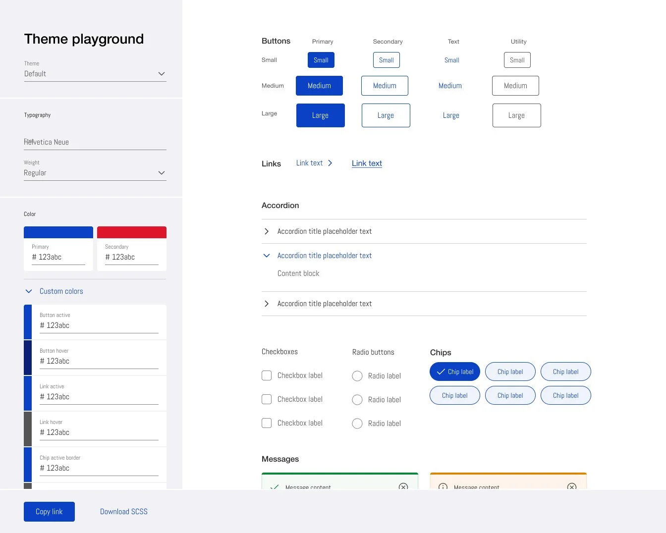
The Theming Playground prototype — real-time theming with WCAG compliance flagged live.
To prove it out, I designed and built a working prototype with development, a Theming Playground that let anyone, designer or not, edit colors at the component level or the full product-template level, with WCAG compliance flagged in real time. That prototype sold the schema harder than any deck did.
Outcome
~85% reduction in white-label setup time, a process that used to run a full development lifecycle now moves in a few sprints
Custom code for theming eliminated entirely, deviations that used to require hand-coded overrides outside the design system no longer needed a workaround
18+ teams across U.S. Bank segments requested to join Beta, including international teams, and every partner brand team moved to production on the new schema
The real win wasn't scale, partner brands were already growing. It was that clients had been leaving because the system couldn't express their visual identity, and this stopped that bleed. I don't have an aggregate retention number, but I know of specific clients retained who'd been at risk over exactly this problem.
Internally, every team benefited, even ones not white-labeling, since theming logic that used to require one-off definitions was now built into the tokens. The architecture also became a commercial product: the same system serving U.S. Bank's own teams was now something the bank could license to partner banks and credit unions.
Released April 2022 after Alpha and Beta testing. Featured at the 2022 USB UX & Product Design Summit, where I also presented a cross-org webinar on the token architecture.
Reflection
The hardest part of this project wasn't the token architecture. It was getting people to trust a naming system that looked more complicated before it got simpler. I sold it the same way the interviews sold me on the problem: not with a deck, but by putting the thing in people's hands and letting them theme something themselves. What actually mattered, though, wasn't elegance. It was that partner brands stopped leaving over something we could have just fixed.
U.S. Bank
About This Project
U.S. Bank's design system served 1,500+ white-labeled partner brands, a large source of revenue for the bank. The token architecture behind it wasn't built to carry that weight, and every brand that couldn't fit inside it meant hand-coded work outside the system.
The Challenge
U.S. Bank's design system served 1,500+ white-labeled partner brands, brands that account for a large share of the bank's revenue. The system couldn't keep up with them. Partners couldn't fully express their own color palettes on their white-labeled products. Every deviation from the system meant custom code, work that fell outside the tokens and landed directly on design and engineering.
Sample of token mapping to Harley Davidson white-label products
The workaround was worse than the problem it was solving. Teams documented color selections per product page in a PDF form, then went back and forth by hand over accessibility issues and brand alignment, then had engineers hand-code each page outside the design system, because the tokens weren't built for palettes larger than U.S. Bank's own. Across 1,500+ partners, that meant real bottlenecks: slower time to solution for designers, brand liaisons, and developers alike.
How I Approached It
I started with a lot of ambiguity. We knew something was broken, but not exactly what, only that it kept straining relationships with partner teams. I ran a discovery session with a partner support team to see the white-labeling workflow firsthand, then widened out: a competitive analysis across six major design systems, USWDS, Google Material, IBM Carbon, Salesforce Lightning, Shopify Polaris, Intuit QuickBooks, to see how each handled component theming, color, typography, and token structure.
Then I interviewed 8 teams, designers, product managers, accessibility consultants, and partner brand liaisons, across several sessions. That confirmed what the competitive research suggested: our tokens were the limiting factor. I had to build the case for that in terms the business would act on, what the limits were actually costing in production time, resourcing, and partner-brand retention. The fix wasn't a small edit. It meant restructuring the token schema across the entire component and pattern library. I worked closely with the DS Core team, designers, developers, and product owners across nine internal teams, plus several partner brand teams who tested the schema against their own palettes.
What We Built
I built the new schema around a concept I called Purpose, tokens named for the role they play in the interface, not just their value. A button's primary color and a data table's border shouldn't share a naming convention just because they're both blue. I mapped every component to what needed to be themable, and at what depth: color, borders, elevation, shadows, shape, size, fonts.
The naming system, I called it SHLD, deliberately not U.S. Bank-branded, since it needed to serve partner brands who don't want their parent bank's name inside their own tooling, ran four levels deep: Namespace (the system itself), Object (the component), Base (the foundational category, like color or size), and Modifier (the variation applied on interaction, like hover or dark mode). It mapped onto our existing Atomic Design structure: Elements, Compounds, Pages.
The Theming Playground prototype — real-time theming with WCAG compliance flagged live.
To prove it out, I designed and built a working prototype with development, a Theming Playground that let anyone, designer or not, edit colors at the component level or the full product-template level, with WCAG compliance flagged in real time. That prototype sold the schema harder than any deck did.
Outcome
~85% reduction in white-label setup time, a process that used to run a full development lifecycle now moves in a few sprints
Custom code for theming eliminated entirely, deviations that used to require hand-coded overrides outside the design system no longer needed a workaround
18+ teams across U.S. Bank segments requested to join Beta, including international teams, and every partner brand team moved to production on the new schema
The real win wasn't scale, partner brands were already growing. It was that clients had been leaving because the system couldn't express their visual identity, and this stopped that bleed. I don't have an aggregate retention number, but I know of specific clients retained who'd been at risk over exactly this problem.
Internally, every team benefited, even ones not white-labeling, since theming logic that used to require one-off definitions was now built into the tokens. The architecture also became a commercial product: the same system serving U.S. Bank's own teams was now something the bank could license to partner banks and credit unions.
Released April 2022 after Alpha and Beta testing. Featured at the 2022 USB UX & Product Design Summit, where I also presented a cross-org webinar on the token architecture.
Reflection
The hardest part of this project wasn't the token architecture. It was getting people to trust a naming system that looked more complicated before it got simpler. I sold it the same way the interviews sold me on the problem: not with a deck, but by putting the thing in people's hands and letting them theme something themselves. What actually mattered, though, wasn't elegance. It was that partner brands stopped leaving over something we could have just fixed.
U.S. Bank
About This Project
U.S. Bank's design system served 1,500+ white-labeled partner brands, a large source of revenue for the bank. The token architecture behind it wasn't built to carry that weight, and every brand that couldn't fit inside it meant hand-coded work outside the system.
The Challenge
U.S. Bank's design system served 1,500+ white-labeled partner brands, brands that account for a large share of the bank's revenue. The system couldn't keep up with them. Partners couldn't fully express their own color palettes on their white-labeled products. Every deviation from the system meant custom code, work that fell outside the tokens and landed directly on design and engineering.
Sample of token mapping to Harley Davidson white-label products
The workaround was worse than the problem it was solving. Teams documented color selections per product page in a PDF form, then went back and forth by hand over accessibility issues and brand alignment, then had engineers hand-code each page outside the design system, because the tokens weren't built for palettes larger than U.S. Bank's own. Across 1,500+ partners, that meant real bottlenecks: slower time to solution for designers, brand liaisons, and developers alike.
How I Approached It
I started with a lot of ambiguity. We knew something was broken, but not exactly what, only that it kept straining relationships with partner teams. I ran a discovery session with a partner support team to see the white-labeling workflow firsthand, then widened out: a competitive analysis across six major design systems, USWDS, Google Material, IBM Carbon, Salesforce Lightning, Shopify Polaris, Intuit QuickBooks, to see how each handled component theming, color, typography, and token structure.
Then I interviewed 8 teams, designers, product managers, accessibility consultants, and partner brand liaisons, across several sessions. That confirmed what the competitive research suggested: our tokens were the limiting factor. I had to build the case for that in terms the business would act on, what the limits were actually costing in production time, resourcing, and partner-brand retention. The fix wasn't a small edit. It meant restructuring the token schema across the entire component and pattern library. I worked closely with the DS Core team, designers, developers, and product owners across nine internal teams, plus several partner brand teams who tested the schema against their own palettes.
What We Built
I built the new schema around a concept I called Purpose, tokens named for the role they play in the interface, not just their value. A button's primary color and a data table's border shouldn't share a naming convention just because they're both blue. I mapped every component to what needed to be themable, and at what depth: color, borders, elevation, shadows, shape, size, fonts.
The naming system, I called it SHLD, deliberately not U.S. Bank-branded, since it needed to serve partner brands who don't want their parent bank's name inside their own tooling, ran four levels deep: Namespace (the system itself), Object (the component), Base (the foundational category, like color or size), and Modifier (the variation applied on interaction, like hover or dark mode). It mapped onto our existing Atomic Design structure: Elements, Compounds, Pages.
The Theming Playground prototype — real-time theming with WCAG compliance flagged live.
To prove it out, I designed and built a working prototype with development, a Theming Playground that let anyone, designer or not, edit colors at the component level or the full product-template level, with WCAG compliance flagged in real time. That prototype sold the schema harder than any deck did.
Outcome
~85% reduction in white-label setup time, a process that used to run a full development lifecycle now moves in a few sprints
Custom code for theming eliminated entirely, deviations that used to require hand-coded overrides outside the design system no longer needed a workaround
18+ teams across U.S. Bank segments requested to join Beta, including international teams, and every partner brand team moved to production on the new schema
The real win wasn't scale, partner brands were already growing. It was that clients had been leaving because the system couldn't express their visual identity, and this stopped that bleed. I don't have an aggregate retention number, but I know of specific clients retained who'd been at risk over exactly this problem.
Internally, every team benefited, even ones not white-labeling, since theming logic that used to require one-off definitions was now built into the tokens. The architecture also became a commercial product: the same system serving U.S. Bank's own teams was now something the bank could license to partner banks and credit unions.
Released April 2022 after Alpha and Beta testing. Featured at the 2022 USB UX & Product Design Summit, where I also presented a cross-org webinar on the token architecture.
Reflection
The hardest part of this project wasn't the token architecture. It was getting people to trust a naming system that looked more complicated before it got simpler. I sold it the same way the interviews sold me on the problem: not with a deck, but by putting the thing in people's hands and letting them theme something themselves. What actually mattered, though, wasn't elegance. It was that partner brands stopped leaving over something we could have just fixed.
U.S. Bank
About This Project
U.S. Bank's design system served 1,500+ white-labeled partner brands, a large source of revenue for the bank. The token architecture behind it wasn't built to carry that weight, and every brand that couldn't fit inside it meant hand-coded work outside the system.
The Challenge
U.S. Bank's design system served 1,500+ white-labeled partner brands, brands that account for a large share of the bank's revenue. The system couldn't keep up with them. Partners couldn't fully express their own color palettes on their white-labeled products. Every deviation from the system meant custom code, work that fell outside the tokens and landed directly on design and engineering.
Sample of token mapping to Harley Davidson white-label products
The workaround was worse than the problem it was solving. Teams documented color selections per product page in a PDF form, then went back and forth by hand over accessibility issues and brand alignment, then had engineers hand-code each page outside the design system, because the tokens weren't built for palettes larger than U.S. Bank's own. Across 1,500+ partners, that meant real bottlenecks: slower time to solution for designers, brand liaisons, and developers alike.
How I Approached It
I started with a lot of ambiguity. We knew something was broken, but not exactly what, only that it kept straining relationships with partner teams. I ran a discovery session with a partner support team to see the white-labeling workflow firsthand, then widened out: a competitive analysis across six major design systems, USWDS, Google Material, IBM Carbon, Salesforce Lightning, Shopify Polaris, Intuit QuickBooks, to see how each handled component theming, color, typography, and token structure.
Then I interviewed 8 teams, designers, product managers, accessibility consultants, and partner brand liaisons, across several sessions. That confirmed what the competitive research suggested: our tokens were the limiting factor. I had to build the case for that in terms the business would act on, what the limits were actually costing in production time, resourcing, and partner-brand retention. The fix wasn't a small edit. It meant restructuring the token schema across the entire component and pattern library. I worked closely with the DS Core team, designers, developers, and product owners across nine internal teams, plus several partner brand teams who tested the schema against their own palettes.
What We Built
I built the new schema around a concept I called Purpose, tokens named for the role they play in the interface, not just their value. A button's primary color and a data table's border shouldn't share a naming convention just because they're both blue. I mapped every component to what needed to be themable, and at what depth: color, borders, elevation, shadows, shape, size, fonts.
The naming system, I called it SHLD, deliberately not U.S. Bank-branded, since it needed to serve partner brands who don't want their parent bank's name inside their own tooling, ran four levels deep: Namespace (the system itself), Object (the component), Base (the foundational category, like color or size), and Modifier (the variation applied on interaction, like hover or dark mode). It mapped onto our existing Atomic Design structure: Elements, Compounds, Pages.
The Theming Playground prototype — real-time theming with WCAG compliance flagged live.
To prove it out, I designed and built a working prototype with development, a Theming Playground that let anyone, designer or not, edit colors at the component level or the full product-template level, with WCAG compliance flagged in real time. That prototype sold the schema harder than any deck did.
Outcome
~85% reduction in white-label setup time, a process that used to run a full development lifecycle now moves in a few sprints
Custom code for theming eliminated entirely, deviations that used to require hand-coded overrides outside the design system no longer needed a workaround
18+ teams across U.S. Bank segments requested to join Beta, including international teams, and every partner brand team moved to production on the new schema
The real win wasn't scale, partner brands were already growing. It was that clients had been leaving because the system couldn't express their visual identity, and this stopped that bleed. I don't have an aggregate retention number, but I know of specific clients retained who'd been at risk over exactly this problem.
Internally, every team benefited, even ones not white-labeling, since theming logic that used to require one-off definitions was now built into the tokens. The architecture also became a commercial product: the same system serving U.S. Bank's own teams was now something the bank could license to partner banks and credit unions.
Released April 2022 after Alpha and Beta testing. Featured at the 2022 USB UX & Product Design Summit, where I also presented a cross-org webinar on the token architecture.
Reflection
The hardest part of this project wasn't the token architecture. It was getting people to trust a naming system that looked more complicated before it got simpler. I sold it the same way the interviews sold me on the problem: not with a deck, but by putting the thing in people's hands and letting them theme something themselves. What actually mattered, though, wasn't elegance. It was that partner brands stopped leaving over something we could have just fixed.